
If you have a feeling that something is wrong in your logo, our article will tell you what’s wrong. And with the help of Turbologo online logo maker, you can fix all the mistakes.
What is a logo
A logo is a set of graphic elements capable of symbolizing the activities of the company in the most detailed and visual way, as well as all the goods it produces. The logo occupies an important place in the corporate identity structure, sometimes being a forming unit.
The logo needs to meet a huge number of very different parameters. This is important when providing the information embedded in it. These days, a logo is like a flag on a ship.
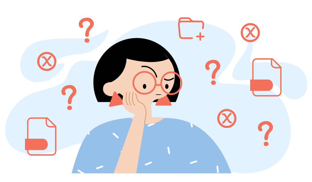
Errors when creating a logo
Outdated tricks
Legacy graphics are hard to recognize and measure. Even a very good designer will not always be able to explain why one graphic is outdated and another is not.
Most often, it’s about outdated techniques: when Photoshop first appeared, everyone began to do graphic design, using the effects built into the program at random. Back then, these techniques looked fresh and innovative, but now they are outdated, and we perceive them differently.
Here are the top 3 outdated tricks that are easy to recognize in a logo.
Shadow
A shadow is an extremely inappropriate technique in a logo: why simulate the casting of a shadow by an object in unnatural scenarios for this?
Glow
As with the shadow, the simulation of the logo’s glow looks ridiculous and creates a lot of inconvenience in its use.
Illusion 3D / embossed
The same logic applies to the 3D simulation in the logo – it will be extremely inconvenient to use this option on various media.
Exceptions
Of course, there are cases when a shadow, 3D illusion or glow look appropriate in logos, but only if these techniques complement the concept and are used wisely. But even such logos must have a monochrome version without applied effects for use, for example, on printed media.
Unsuccessful selection of colors
Each color has its own parameters of tone, saturation, brightness, and its place in a particular color model. Learning to perceive colors like a designer is a separate superpower.
Too intense
Through evolution, our eyes have become accustomed to responding faster to richer colors so that we can more quickly detect danger and protect ourselves from predators. Hence, bright colors cause a higher load on our retina. Too saturated colors irritate the user’s eyes, making it difficult for people to look at them.
Little contrast
Contrast in design is an extremely important element, and if the colors in the logo are not contrasted enough, the logo will be less readable and the colors in it will merge together.
To check your logo for contrast, apply a black and white effect – less contrasting colors will become closer to each other in gray level.
Dirty gradients
Even from a good color combination, an unsuccessful gradient can turn out if chiaroscuro is not taken into account when creating it. You can recognize a dirty gradient by the unwanted gray tints that appear at the junction of colors.
Congestion
The overload of the logo occurs if you place too many elements in it. This leads to bad readability of the logo – the user will not be able to understand what is depicted on it, and is less likely to recognize your brand on the next contact.
A logo overloaded with elements may look good at a large size, but more often than not, people interact with the logo in a different way: from afar or at a quick glance, and this must be taken into account! Reduce or apply blur to your logo to test its readability in more realistic conditions.
Weak composition
Weak composition is not easy to recognize at a cursory glance, being a non-designer. We have identified the 4 most common causes of problems in the composition, we will consider them below.
Errors in proportions
Designers refer to proportion errors as “mass” errors. The “mass” of elements is their “density” relative to other elements in the logo – when one object is visually much larger than another, an imbalance occurs.
Bad alignment
The balance of the elements in the logo is broken if there is a feeling that the composition is “littered” in one of the directions – the logo immediately seems “unstable”, causing dissonance.
Little air
If you place the elements too close to each other, that is, neglect the “air” between them, “mess” may occur.
Lots of air
Sometimes the distances between the elements are too large, which creates a feeling of “holes” in the logo, which also introduces an imbalance.
That’s all! We hope that our article will help you avoid mistakes and create an effective logo. Good luck!